Designing StudioID’s go-to-market website
Kickstarting a modern and memorable brand with a new digital presence
Design| Posted November 18, 2020
This past July, Industry Dive acquired NewsCred’s Content Marketing Studio and Services. With the acquisition came forty new coworkers, as well as the expansion of the content studio offerings. Combining the expertise from Industry Dive’s Brand Studio and the NewsCred Content Marketing Studio a new agency was formed, StudioID.
Along with a new logo and accompanying style guide, a dialogue began around how the brand-to-demand approach can compete and position themselves as the content marketing leader in the 20+ industries they serve. My team’s job was to design a new website to continue to lay the groundwork for a modern, memorable brand while also showcasing their work and starting conversations with clients.
Defining our aspirations
To kick off discovery, my team and I interviewed StudioID leadership to fully understand the product offerings and aspirations for market fit. We also analyzed the current NewsCred and Brand Studio websites, researched competitors, and outlined a proposed information architecture.
The main challenge we discovered was explaining our brand-to-demand approach and communicating the different types of expertise brought by both teams. Another challenge was that we had just a month and a half to meet the go-to-market deadline.
Embodying the brand
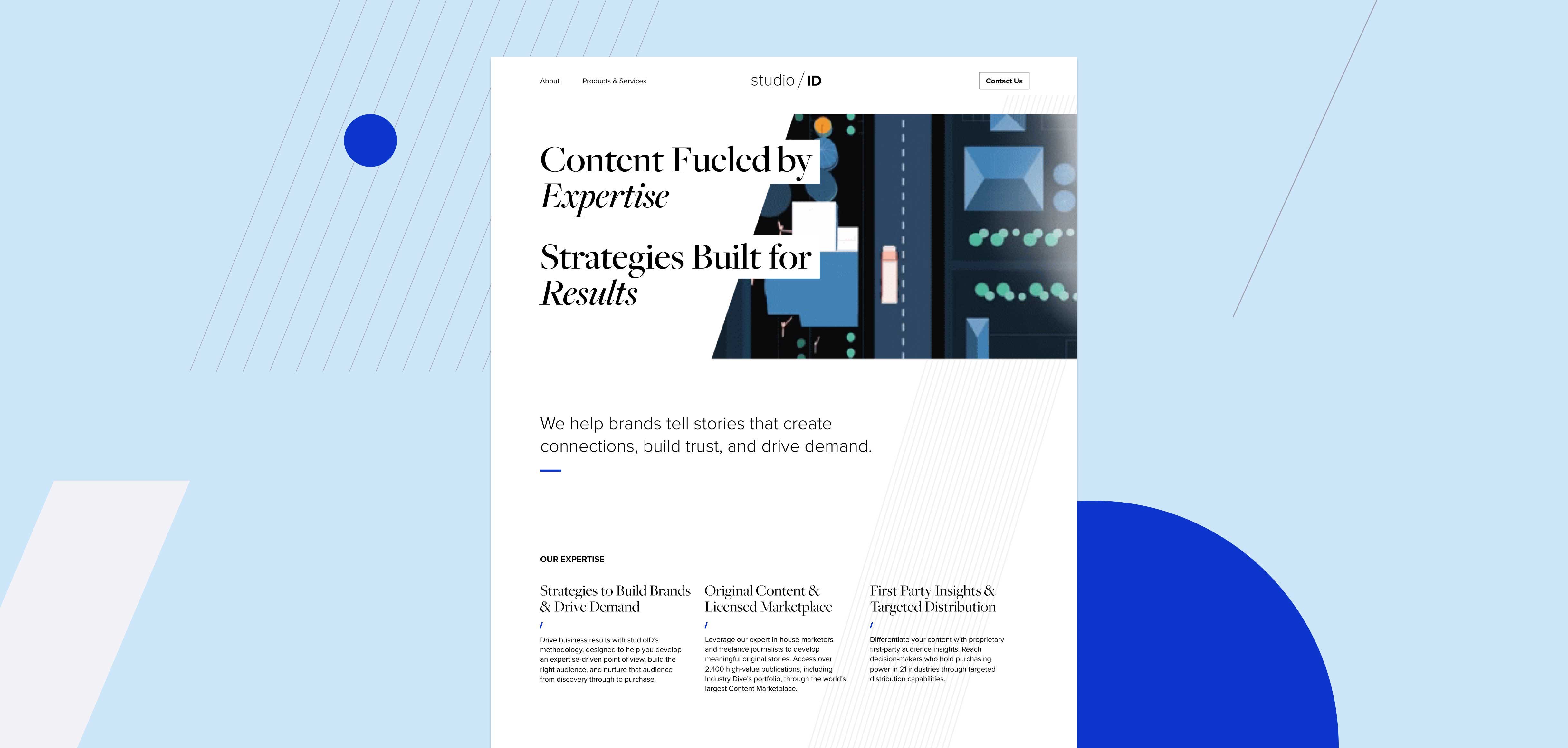
StudioID needed a website that would allow the new agency to make a strong brand introduction, one that would solidify the agency as trustworthy, innovative industry experts. We designed the homepage first to establish the usage of the brand elements defined by our creative team.
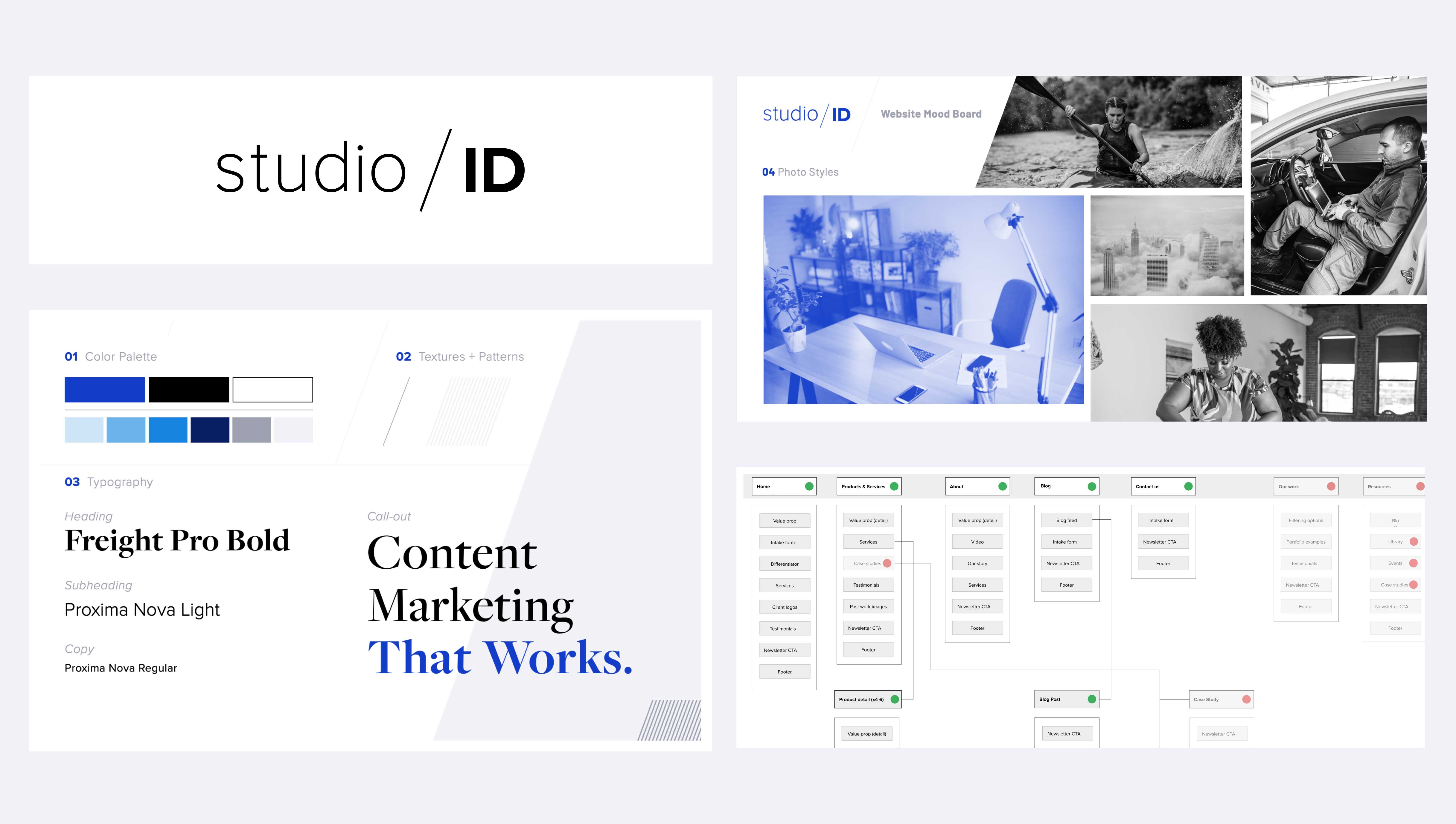
To connect the design with Industry Dive’s editorial origin, we used large serif headings and ample white-space, such as one might see in a print magazine. To emphasize the logo and brand, we incorporated a diagonal pattern in the background and added small diagonal accents across components. The blue in the color palette was used strategically the same way the publication websites use red, sparingly and with purpose. Together these design patterns defined the general aesthetic for the website and unified the vision moving forward.
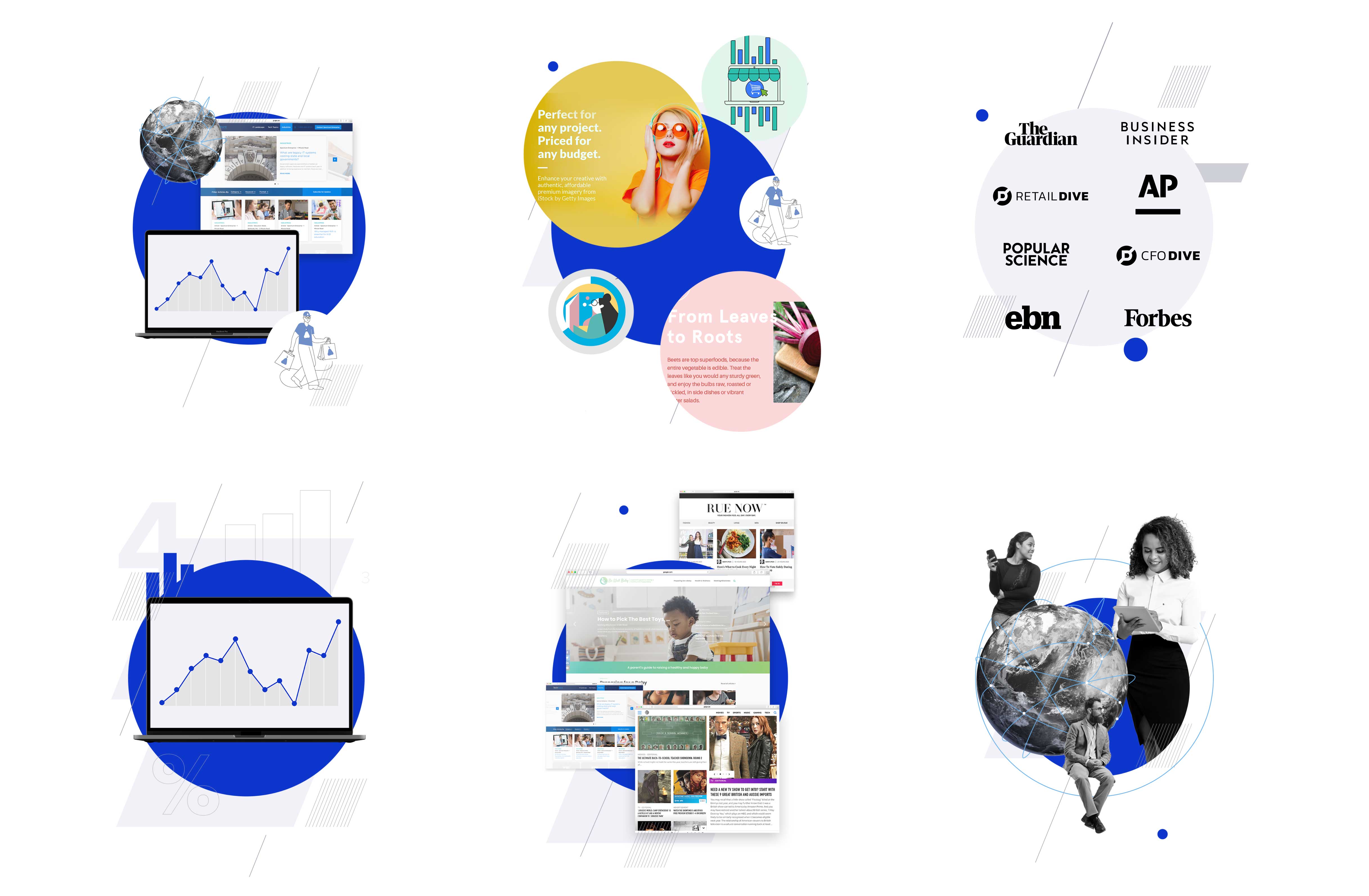
Highlighting our breadth of work
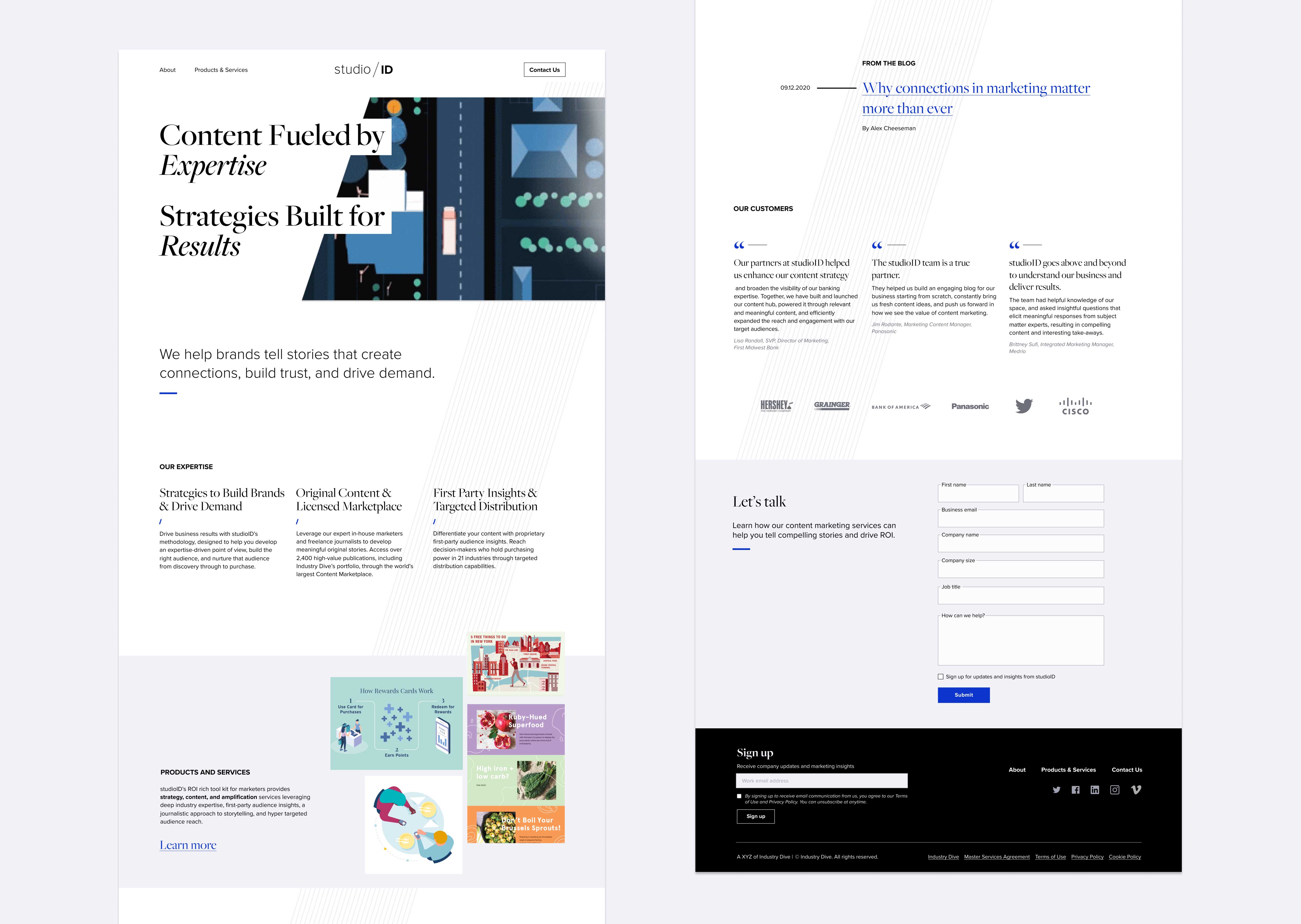
With the combined portfolio of the Brand Studio and NewsCred teams, we needed to showcase the breadth of their work. So as not to pigeonhole them into one digital medium and show that they can stand alongside established agencies, we provided multiple visual opportunities to showcase illustrations, videos, infographics, web projects and more.
The homepage video reel and the rotating collage below the fold highlighted the high-quality range of their work. We also created custom illustrations on the Products and Services page using more abstract references to their offerings to visualize the brand-to-demand approach.
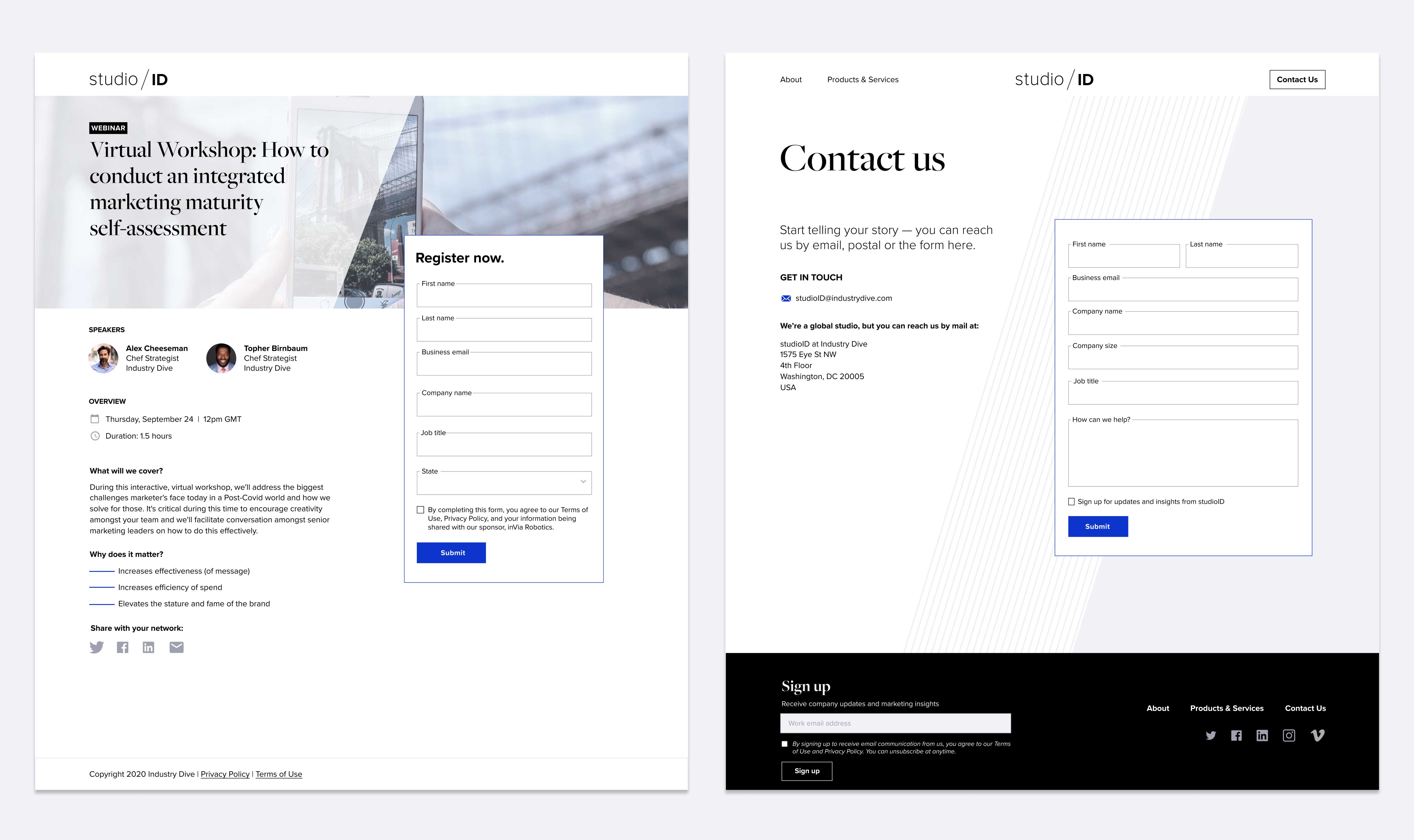
Starting conversations
Alongside establishing the brand, the goal of the StudioID website launch was to begin the conversation with clients about how they can help them. Having a contact form at the bottom of each page provided a persistent, low-effort opportunity for clients to reach out. The emphasized contact button in the top navigation and multiple call-to-action buttons alongside product content further decreased friction and encouraged clients to learn more. We also designed reusable landing pages to help promote in-house thought leadership content and webinars and to gather leads.
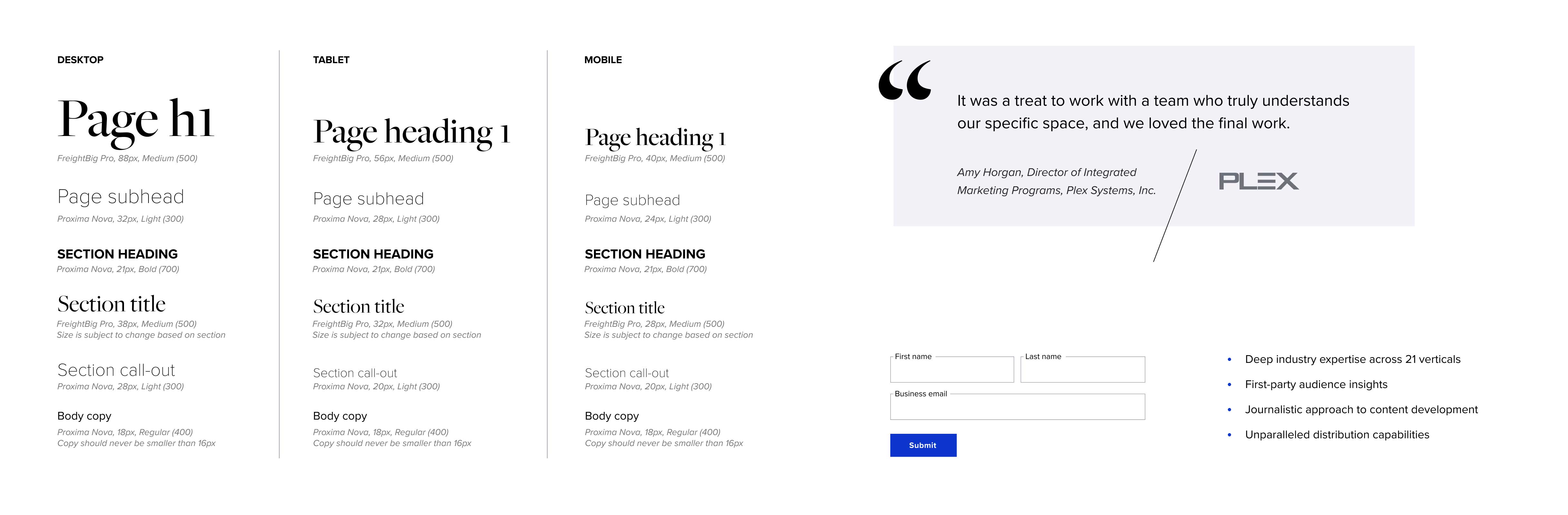
Establishing a foundation
The project had a short deadline so by the end there was a substantial list of desired enhancements. Knowing that the website would need to be flexible for future iterations, we designed the pages component first. My team defined standard headers, buttons, form fields and even more nuanced sections like testimonial call-outs. By delivering reusable components, we’ve made sure that future features, like a blog, will be quick to implement and visually consistent. We’re excited to assist the StudioID team as they define these new features and make their mark in the industry.