Improving UI/UX and accessibility on Data Dive
How I went about designing our data aggregation tool to optimize the internal user's experience.
Design| Posted August 10, 2016
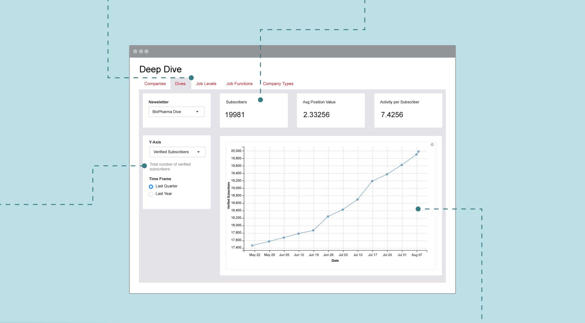
Industry Dive visualizes and aggregates subscriber data for its sales, ad operations and audience development teams. The data the teams analyze is hosted on “Data Dive,” an internal site built on Shiny, an open source R package. Data Dive allows team members to see information about our subscribers through tables and graphs.
While the app was informative, it was not customized to our internal users. Before I began redesigning the application, I conducted usability interviews with our teams. The tests informed me on current user flows and pain points in users’ processes. I split user feedback into two categories — increasing visual appeal and creating an accessible and responsive interface. I solved these challenges using HTML/CSS and features already available in the Shiny package.
Research
To start, I brought in internal users and asked them how they use the site. I tried to interview at least one stakeholder from each department — sales, editorial and c-level executives. For the interviews, I adapted a standard list of talking points and questions to ensure my interviews were consistent and thorough. The interviews included five parts:
- Explain the purpose of the meeting – The key is to ensure the user understands the product without revealing too much, creating unintentionally biases.
- What are the user’s goals? – While you may have preconceived notions of what the user needs from the product, the stakeholder’s answers might reveal new considerations.
- How is the user currently trying to achieve these goals? – Here the user describes how often they are using the system and the features they use. It also reveals any workarounds they might currently use to avoid pain points.
- Show me how you use the application – Testing the application is the meat of the interview. It shows how the user interacts with the tool and where they run into problems. It allows for the user to critique the current layout and process and verbalize their questions and concerns.
- Is there anyone else we should interview? – It is important you interview not only the key stakeholders but also anyone who may use the application and experience different points of friction. While it is easy to appease two people’s problems, you’ve made little progress as a designer if other users continue to have a poor experience with the product.
From this process, I found many areas for improvement. While each user had different feedback, these were the large overlapping takeaways:
The users didn’t care about the graphs. When they use the site, they want to see the raw data. While all of the data is helpful, there are no cumulative data statistics. They are always broken down in some manner, neglecting the entire picture. A lot of the features are not intuitive and the user doesn’t use specific features because they don’t understand them.
Approach
After determining the user’s pain points and ideal UI features, I defined my proposed solutions and split them into different requirements. This was a three-step breakdown as the interviews resulted in a lot of data to parse. The first sorting of requirements split them into two buckets, front-end and back-end. I could address the front-end issues quickly while the back-end issues would need to be saved for later.
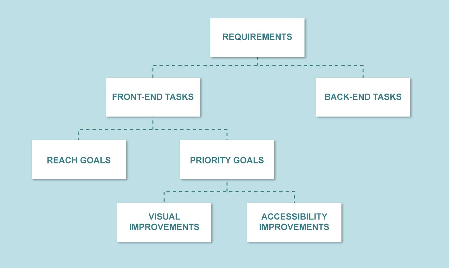
I then further divided the front-end issues by labeling them as either a priority or reach goal. This allowed me to note ideas that could be beneficial in the future but might not be feasible in the short term. Once I began working on the issues, I realized they could be sorted into two different UX goals, visual improvements and accessibility improvements. Both categories would require me to use HTML/CSS and Shiny app interface tools.
Visual improvements
The visual improvements involved increasing visual hierarchy and emphasizing the important data the user needed. To create these style improvements, the first challenge was to incorporate an external CSS sheet. To do this I used ported SASS files for Bootstrap, because Shiny apps are built on Bootstrap, which uses LESS. Because Industry Dive uses SASS for web design, I figured it was best to use it for styling.
In addition to overriding basic Bootstrap styles like typography sizing and colors, I made a few additional UI changes to increase visual appeal:
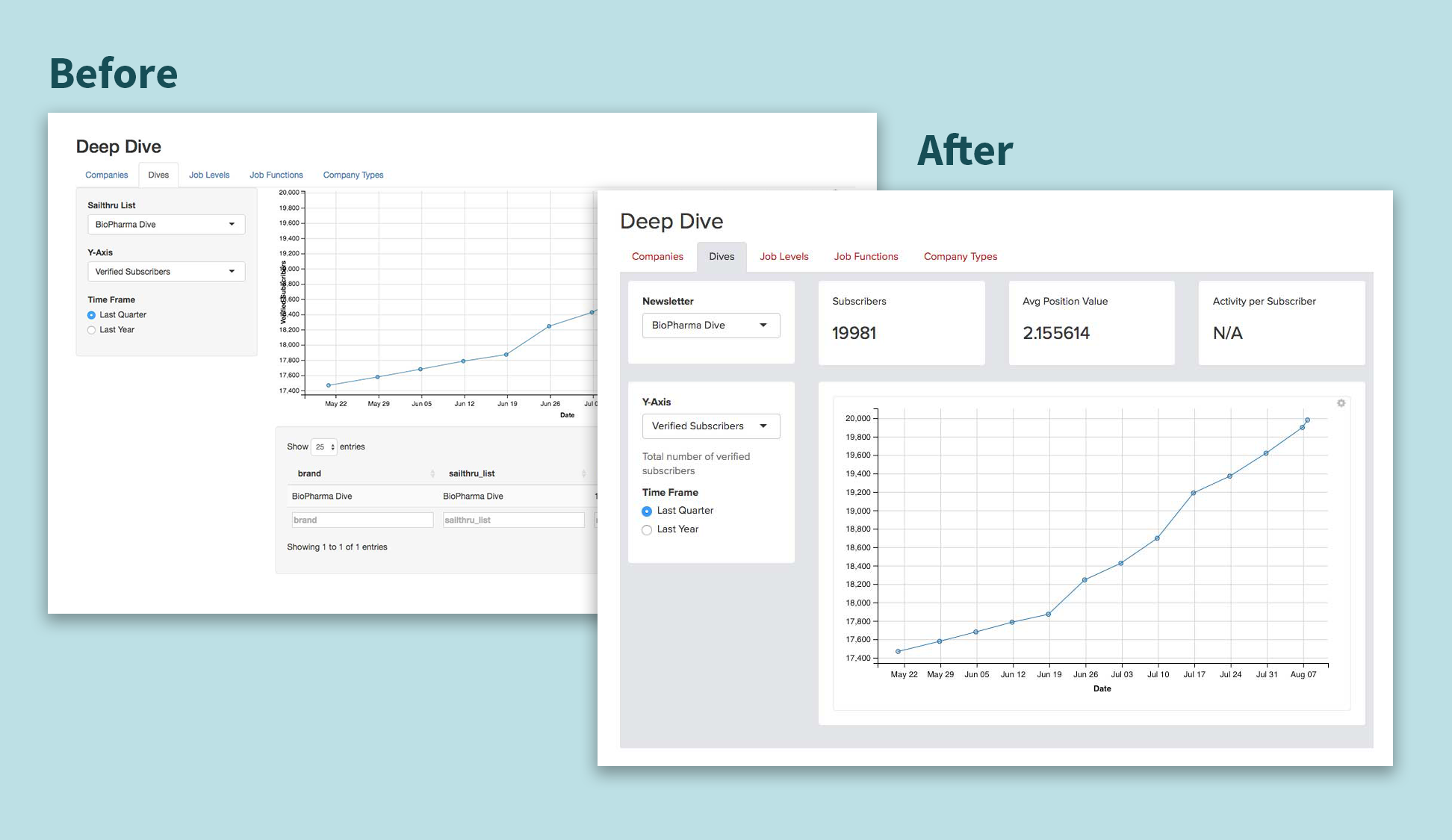
- Made graphs and tables responsive to the user’s screen size. -Rearranged the tables and graphs to create visual hierarchy and improve user accessibility to the data.
- Added modular data call-outs to visually pull out key information to the user.
Accessbility improvements
The accessibility improvements focused on making the web application as intuitive as possible. For example, the web application is pulling so much data, there is a delay before the user can interact with the different features, which caused confusion. To prevent this confusion, I implemented an overlay to show that the app was loading and the user could not yet interact with the app.
Additionally, I increased the usability of sorting and interpreting the tables:
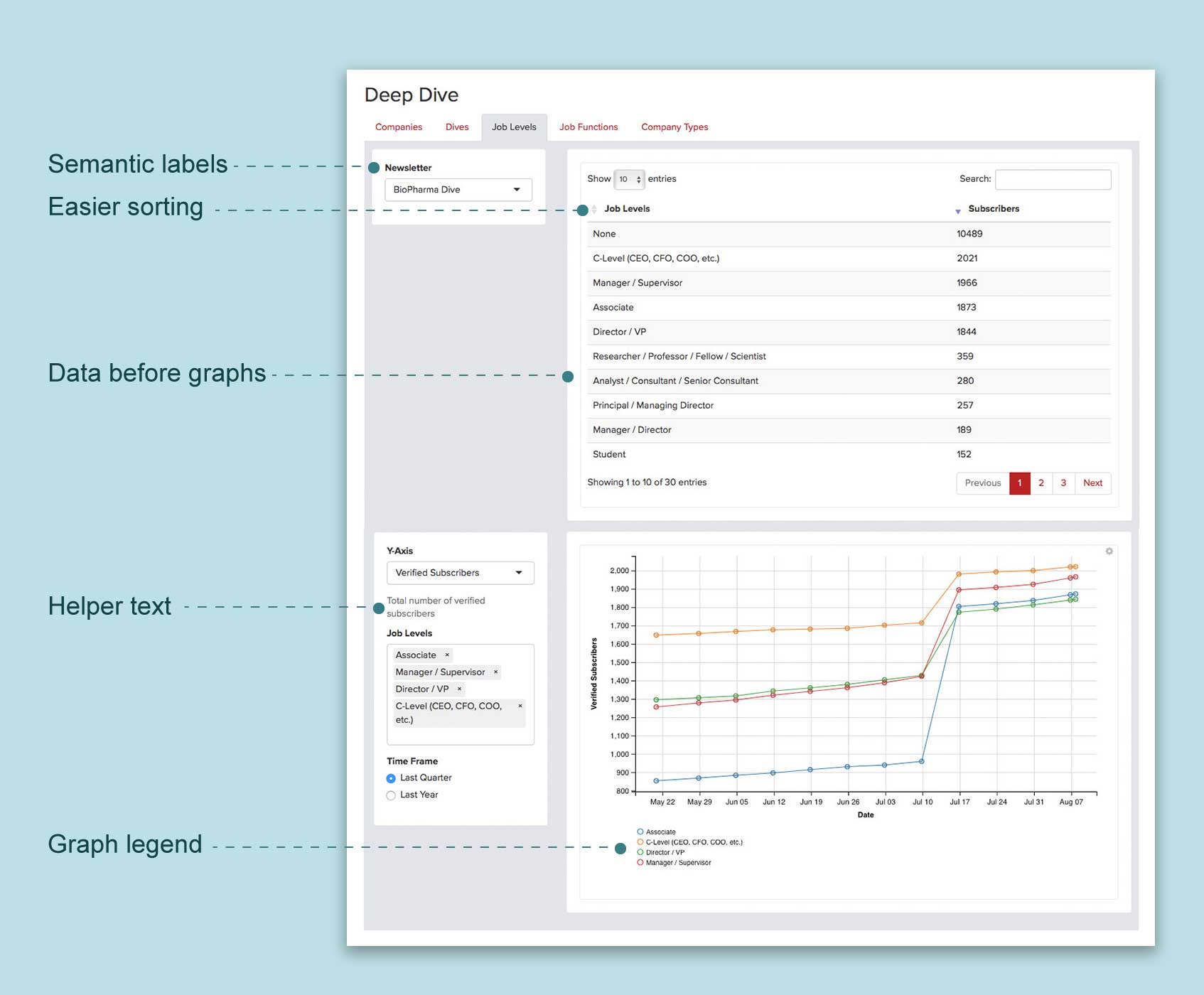
- Made tables sort in descending order from largest value to smallest by default
- Changed the table labels to be semantic rather than what the variable names are
- Increased visibility of the sorting arrows
- Restyled table to make it easy to scan and use
- Added a legend to the graphs to help the user know what each line represents
Together, these improvements made Data Dive significantly easier to use. While there is still a list of back-end requirements that could provide the app with even more functionality, many of the issues were solved with the front-end improvements. Now the app provides a much friendlier user experience and allows users to accomplish their tasks in fewer steps.