Designing "Total Reboot"
How I led the design of a narrative game for our readers.
Design| Posted November 12, 2018
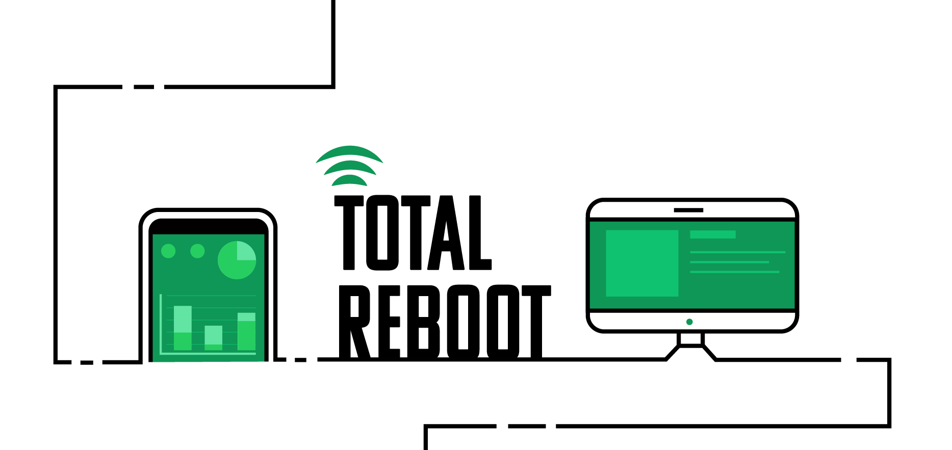
The tech and design team joined together to create an innovative editorial project. We built Total Reboot, a narrative game to engage CIO Dive’s readers and teach them how to craft a well-rounded team.
I partnered with engineer Laura Lorenz, and we used three distinct design phases to develop the overarching UI and UX of the game.
1. Inspiration and Requirement Gathering
The game was a new product so we looked for inspiration from other narrative browser games to get started. In our research, we found three main articles that inspired our project:
- Millennials are Screwed - a Huffingtonpost Highlight article concerning the millennial generation with no user interaction but vertical scroll animations.
- Bloomberg’s American Mall - significant user interaction but not native to the site.
- How today’s generation is turning home buying on its head - similar to Millennials are Screwed but included user interaction that wasn’t mandatory for the experience.
After seeing these examples, we further defined the game we were building. The internal name for the project was CIOregon Trail as we wanted it to mimic a choose your adventure game. The concept is the user is the CIO of their own company and has a set budget to recruit a technical team. They choose employees from a wide range of skill sets (IT, Engineering, Ops, Networks) and then have to survive different scenarios.
Before jumping into user journeys and wireframes, we defined certain parameters of the game. Because this was something we hadn’t done before, even simple questions required a decent amount of discussion.
- Are we designing for a single or multi-level game?
- What character information is important?
- How many scenarios are there per level?
- Is there a single narrative or does the order of scenarios change?
After we all understood the scope of the game, we began to plan what it might look like.
2. Wireframes and Aesthetics
When starting the wireframes, we had two possible approaches we wanted to explore. The first was a vertical flow and as you traveled through the game you would be going down the page. The other option was to make a more distinct game play window that would have the user click through different screens.
We created low fidelity wireframes to get the general ideas across and pick one. After comparing the two, we decided to go with the second option: the distinct game frame with horizontal transitions. This felt more intuitive to the user as most games travel in this direction.
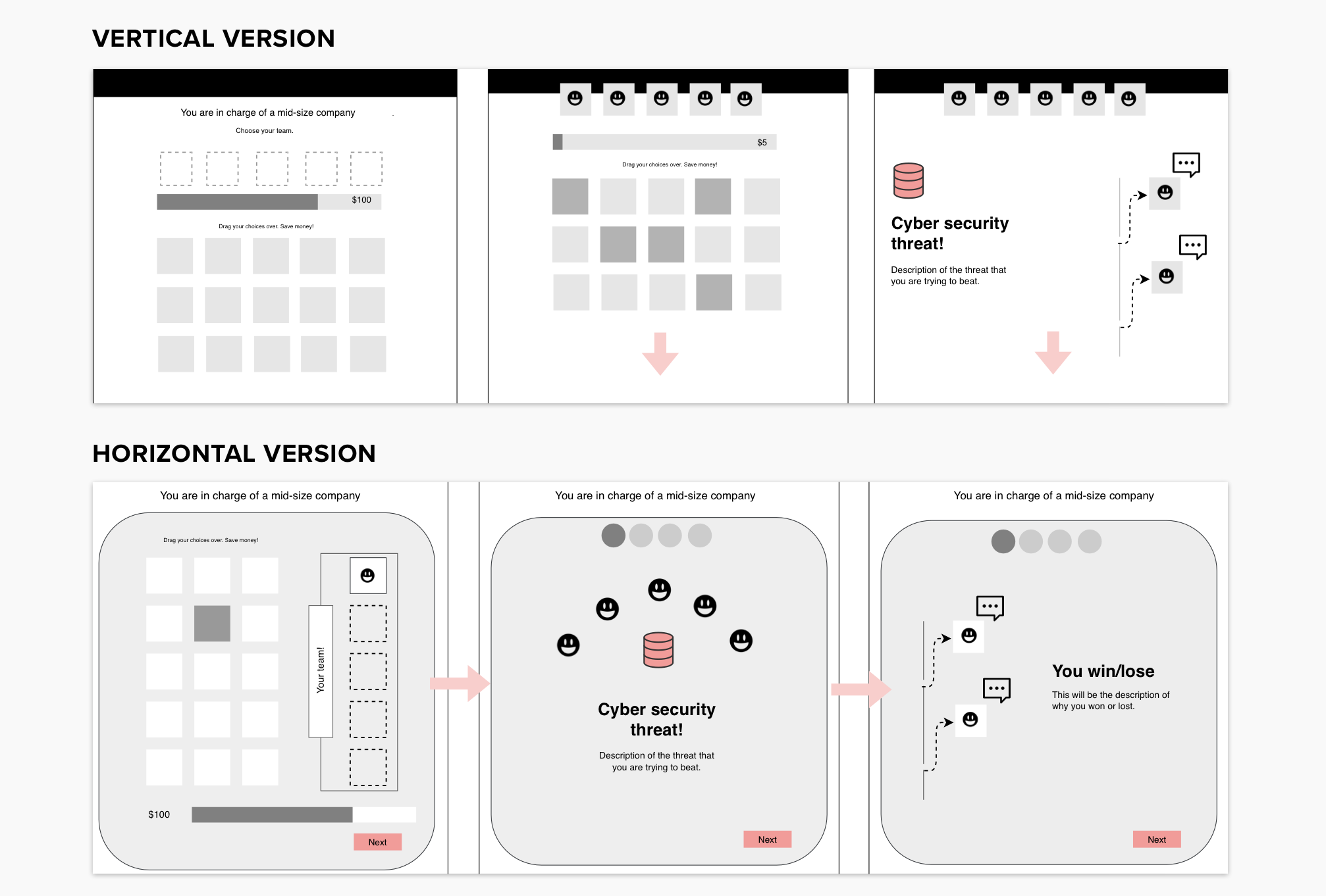
While creating the wireframes, we also assembled an inspiration board to help define the overarching aesthetics of the game. This would give graphic designers a general direction to go with the assets. The mood decided on was: minimal with an intentional use of color, generic but detailed characters and bold, outlined iconography balanced with strong typography.
3. High Fidelity Mockups
Once we had decided on an approach, we started iterating on more detailed mockups.
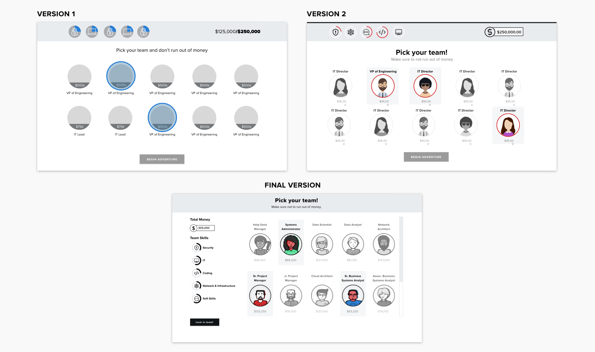
In the first iteration of mocks, we focused on general concepts and providing options.
What you would find in the first round of mocks:
- Page content - determining how we would break up the information. This included deciding when each stage of the game would need its own screen and what information needed to be delivered simultaneously.
- Page hierarchy - organizing what is important on the page. After deciding what was on the page, we also needed to convey the hierarchy of the elements. We wanted to make sure there was a clear order the user should digest the content.
- Game storyboard - defining the user flow through the game. This involved deciding how to visualize the different levels in the game and for the user to understand their progress.
- High-level interactions - transitions between different screens. With the decision to use a horizontal approach for the game, we used buttons to allow the user to progress through the game.
After setting up the initial wireframes, we walked users through the journey to ensure it was functional before committing to refining the product.
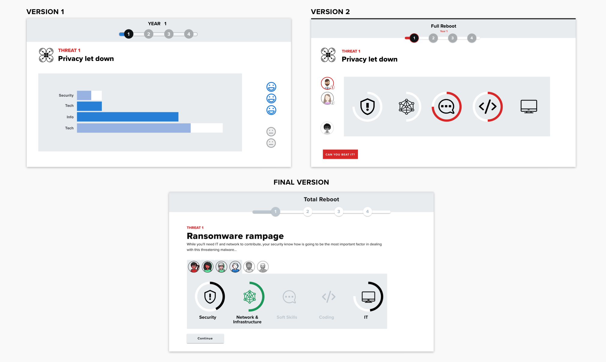
In the second layer of mocks, we refined our options from the first round and added specific details.
- Information visualization - how scores and stats would be conveyed. This was a challenge as we wanted clear visual representations that did not depend on copy.
- Mood and styling - where there would be color vs negative space. It was important to maintain similar aesthetics to our site to ensure the game felt native.
- Animations - how interactions would be signaled to the user. We used animations to draw the users attention to the most important part of the screen. This was typically the scores and stats.
- Assets - defining what we would need from graphic designers. The main components we needed from graphic design were our characters, the scenario images and the top header image.
- UX considerations - making sure components were intuitive. Finally, we ensured all the pieces worked together by user testing and iterating through the game.
Next Steps
From the mock ups, we built a prototype. As you can see in the mock comparisons, there were further updates when the game was implemented. These changes were based on general implementation restrictions as well as progressive enhancements. While we had done some user testing, we had yet to have users actually play through the game with an interactive prototype. We conducted a formal Beta test to learn how we could improve the game before launch.
Team:
UI/UX - Natalie Forman, Jordan Branch, Laura Lorenz
Development - Colin Burr, Laura Lorenz, Miriam Sexton, Josh Brown, James Wilkerson
Visual Assets - Kendall Davis
Concept and Content - Naomi Eide, Deborah Barrington, Alex Hickey, Samantha Schwartz