Auditing Industry Dive's CMS
The second step in gathering CMS UX data. How I created detailed user flow diagrams and auditied our entire system.
UX Research| Posted January 4, 2018
After the design team conducted and analyzed UX interviews, it was important to account for all the features of our current content management system (CMS). I did an in-depth audit to identify all of the features from the most important down to the deprecated ones. I also further evaluated our interviews and created user flow diagrams to understand how people use the systems. Finally, I combined the UX interviews and analysis with the audit and user flows to create comprehensive themes for the redesign.
The audit
From a front-end design perspective, Industry Dive’s CMS was not structured to be maintainable. As the tech team has added features they have been appended to the end of ever-growing pages with handfuls of miscellaneous checkboxes and input fields. So, to prevent losing any active functionalities I conducted an in-depth audit by listing and analyzing all current features.
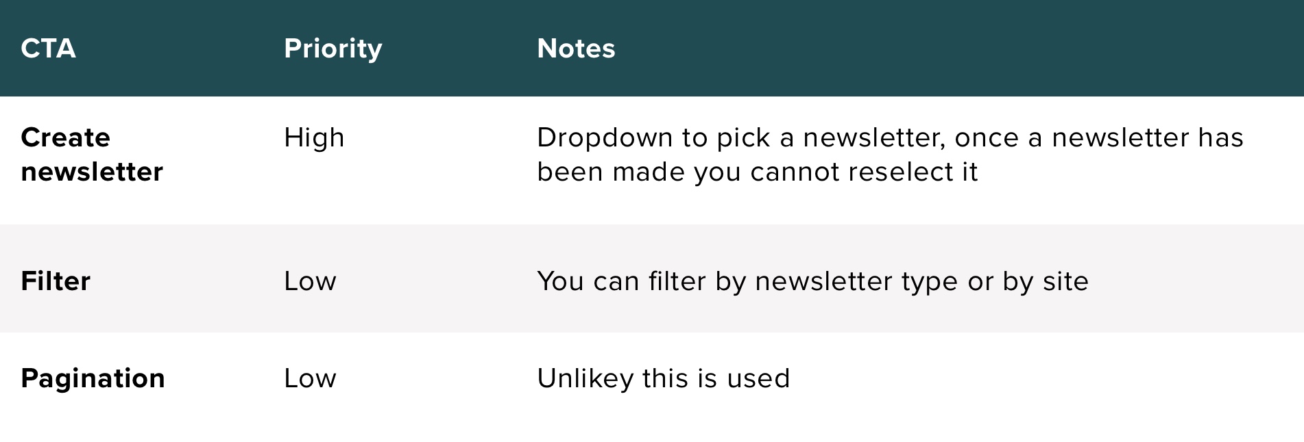
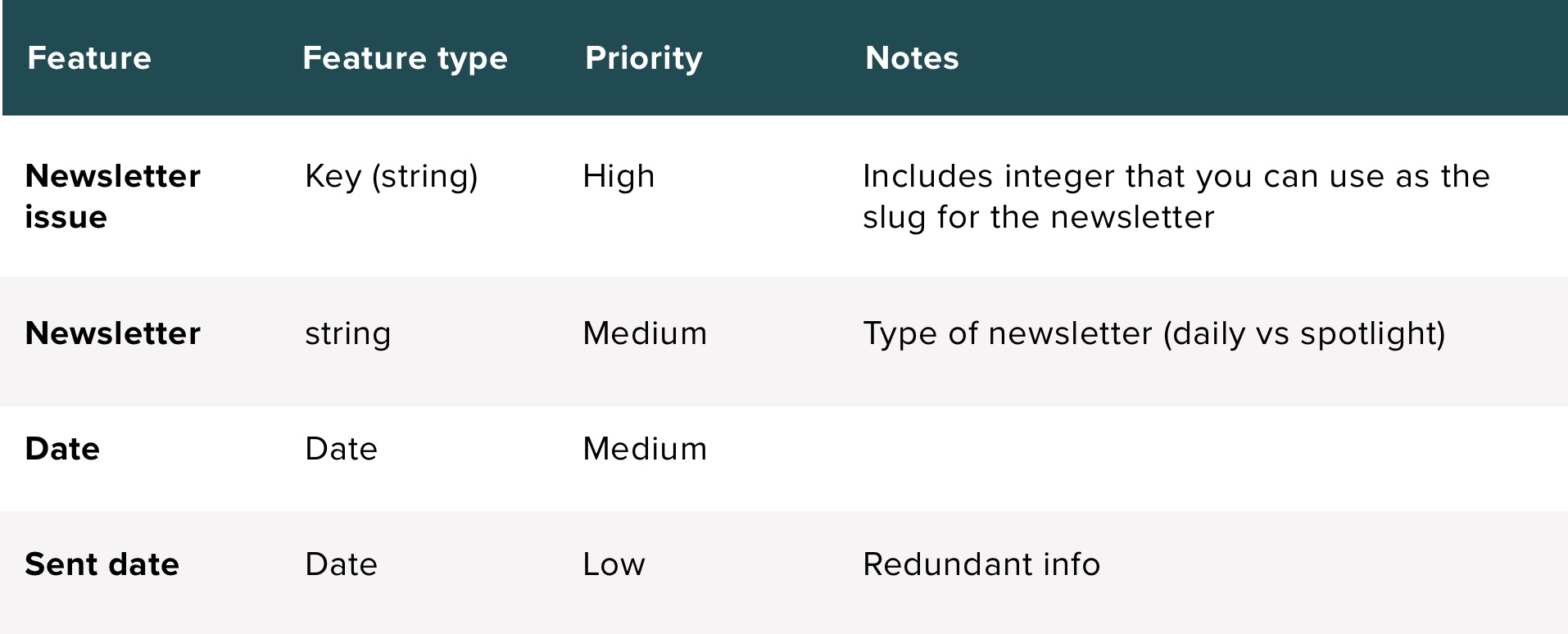
I started the audit of the system by creating a spreadsheet, consisting of one page per CMS screen. On each spreadsheet I listed out all the call-to-actions on that page, prioritized them, and added any notes that might not be obvious. Then I listed out each feature and its data type (integer, text field, key…) as well as prioritized each one and added notes about its functionality.
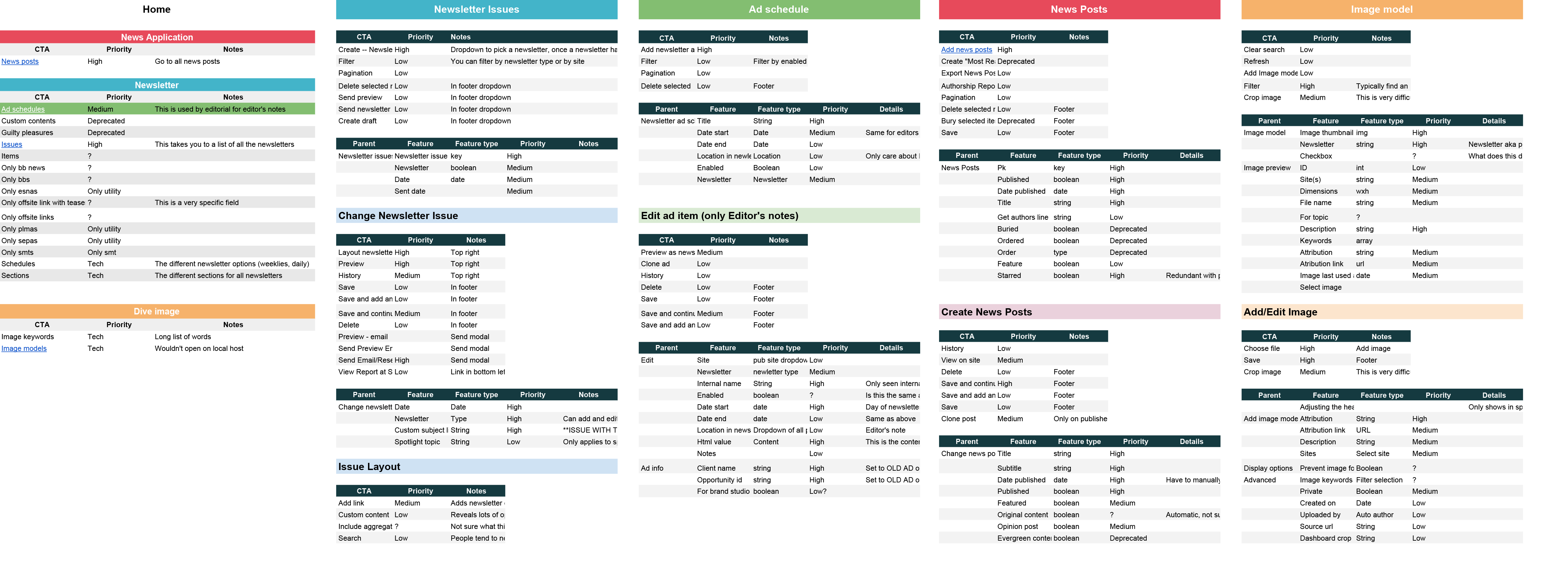
While tedious, this process was informative and gave me a concrete understanding of the system. It highlighted the features we needed to call out and those that needed to be deleted. I also was able to inquire about features I weren’t familiar with to gain a broader understanding of how the user uses the system.
Flowcharts
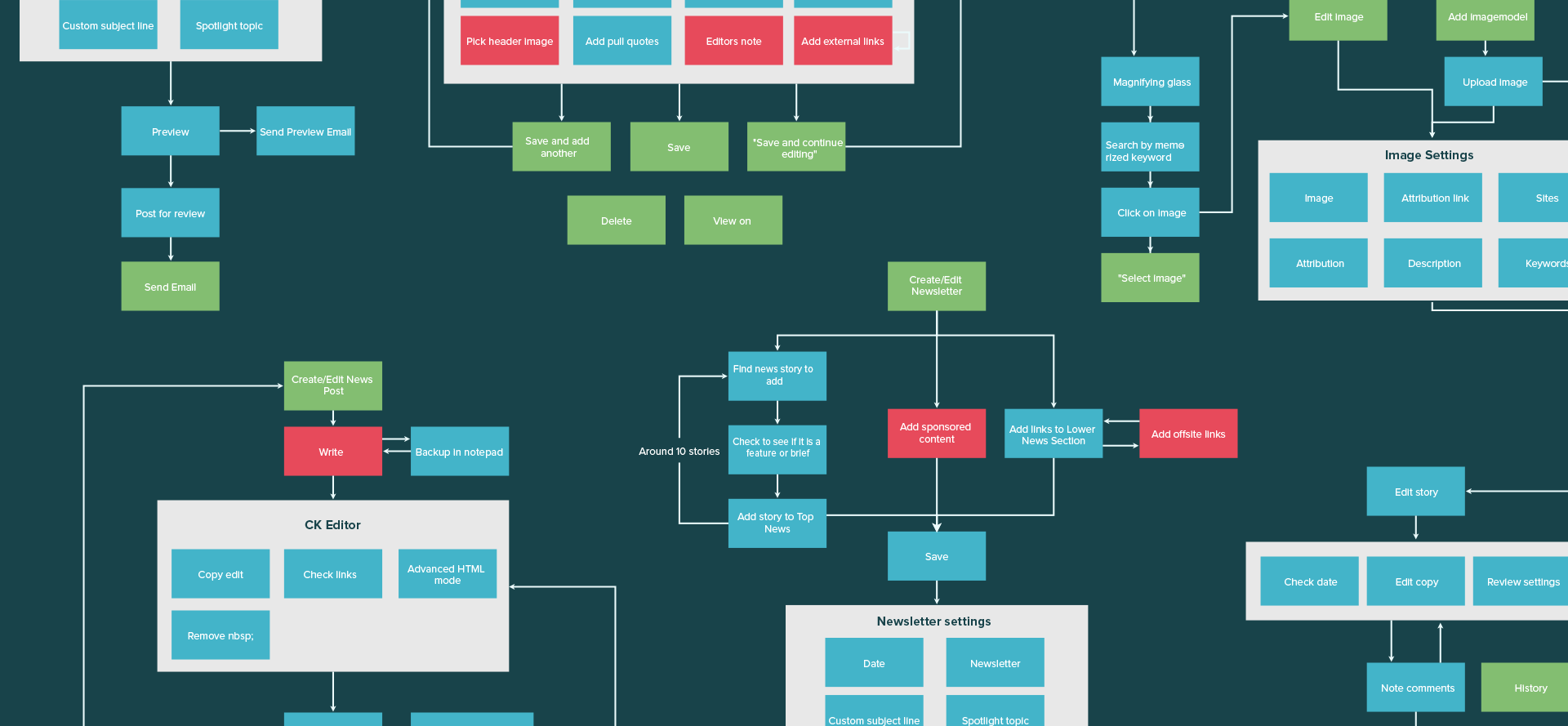
After identifying all the possible CTAs and features in the CMS, I outlined how our editorial team interacted with these elements. By creating user flows I accomplished two main goals. First, I established current user processes so that when designing we could follow a similar structure. Second, I identified hold-ups and possible areas for improvement. For example, when a user has to click through four different screens to edit a high priority feature then there is probably a UX pattern problem.
I documented four common and intricate tasks that the editorial team executes on a daily basis:
- Create a news post
- Create and send a newsletter
- Add and edit images using the image model
- Edit and publish a news post
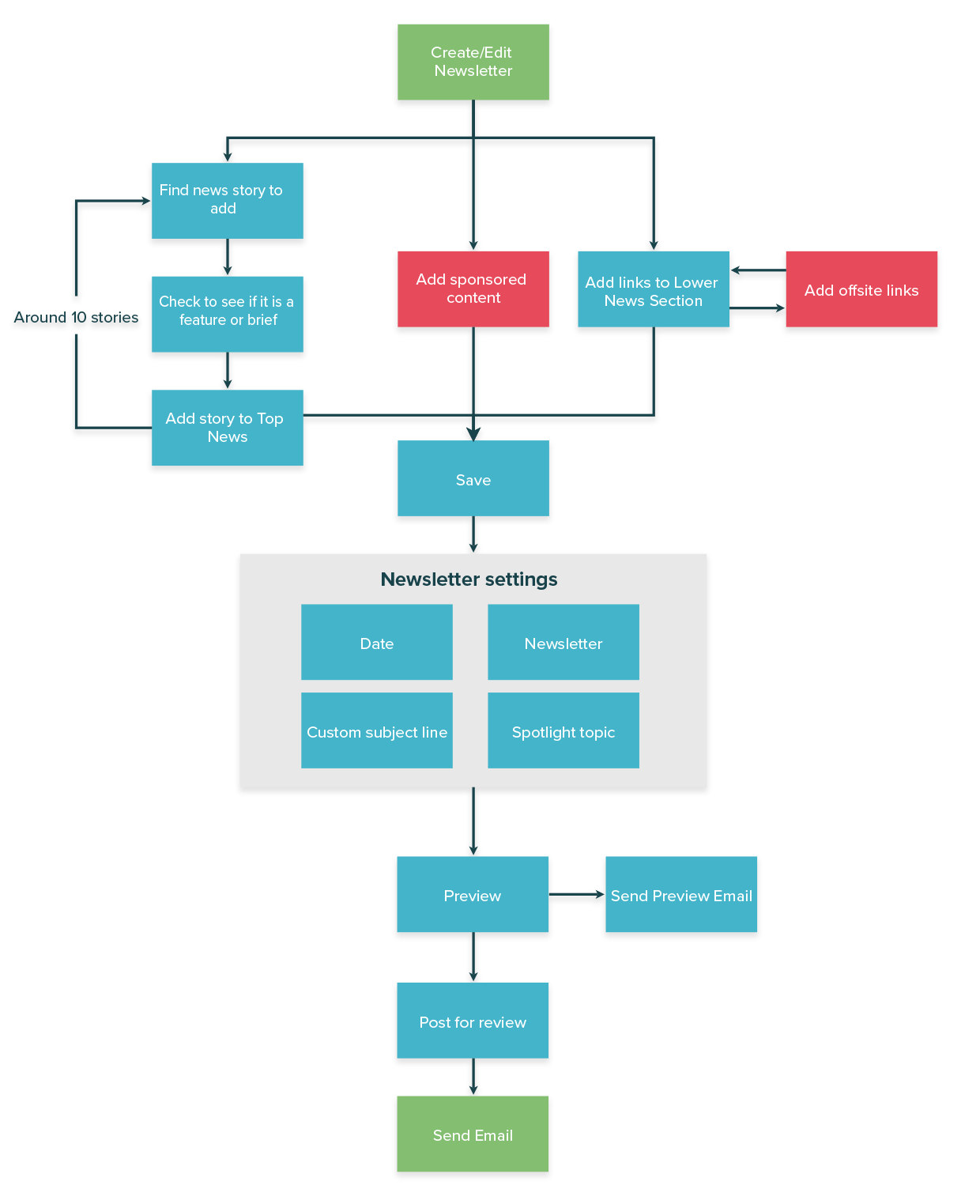
I used draw.io to create the user flows. The colors indicated the features screen location. Green were features found on the main screen as call-to-actions. These are the main goals and higher level functionalities. Pink was an intermediary step that involved other actions outside of the CMS. This might include writing the story in a separate text editor or citing other articles the editor is reading. Then there were the overarching grey sections which involved non-sequential steps in the process. For example, selecting topics and adding a pull quote to an already written news post.
The newspost creation process user flow revealed how many settings weren’t linear. You can see this by how many post settings are grouped together. While this allows the reporter more freedom, it also leaves a high chance of user error. Each setting needs to be remembered to be addressed and changed for each news post.
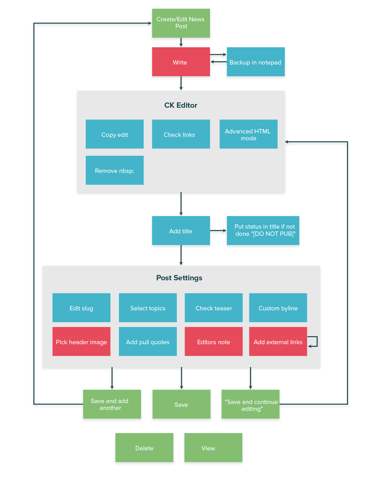
Going through user processes and documenting them in this manner made us think about the decisions our users make. I saw which steps caused hold-ups or in some case were just in the wrong sequential place. Along with this, I discovered tedious processes and opportunities for human error. All together, this showed us the complexity of the system and the intricacies we would need to be mindful of.
The newsletter creation process was more linear than creating the newspost but requires a lot of repetition. This user flow showed how there are many pain points that can be eliminated through automation.
Findings
Now that there was a comprehensive list of all the CMS features and I understood how the users used them I could confidently define our design goals. I combined the themes from the UX interviews with the audit and user flow findings and created action items with clear problems and solutions.
- Improve process flow to create a linear approach and require less steps to completion.
- Increase content hierarchy to call out most used features and hide those that shouldn’t be altered.
- Automate tedious tasks to eliminate human error and free up time for higher priorities.
- Enhance discoverability through effective sorting and searching features.
Notice that all of the goals are broad and provide no exact design solution. This is because I first wanted to determine main product themes for the CMS and understand our users’ priorities. Now that I can relate to and understand the editorial process and hold-ups, we can start creating rough mocks and brainstorming real solutions.
In the short term, Nan Copeland outlined easy improvements that could be made immediately that assist these goals. Even these small improvements help the editorial team’s communication and efficiency while they wait for the redesigned CMS.