The challenge
In the fall of 2018, Industry Dive began its organizational transition from hybrid front-end designers and backend developers to two scrum teams comprised of product designers and full-stack engineers.
With this transition came a number of issues:
- The engineering team was creating multiple, differing versions of common components.
- Product designers spent significant time on-boarding engineers to the front-end codebase due to its complexity.
- Product designers were not thinking globally when creating UI mockups.
To address these issues I helped build a maintainable design system for our publication websites. The design system would resolve our process inefficiencies and provide a single source of truth for use across teams. Myself and one other product designer owned this project from start to finish with the VP of Design overseeing the process. I assisted in every step of the project, leading development for half of the components and reviewing the others.
Defining components
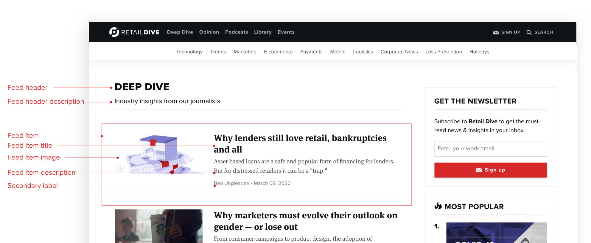
To kickstart the project, we made a list of UI components—e.g. alerts, buttons, etc.—that are often used throughout our publication websites. While design principles and guidelines are essential to a complete system, we focused on creating reusable UI components first. This way we could maximize the impact and practical value for Engineering.
After creating our minimum viable product (MVP) component list, we defined each component’s purpose—e.g. “Alert banners communicate key information, globally”—and determined if it was a stand-alone element (atom) or a group of smaller components (molecule). For our MVP we also included two main design building blocks: color and typography.
Our initial list of components:
- Alerts (atom)
- Buttons (atom)
- Feeds (molecule)
- Form elements (atom)
- Labels (atom)
- Messages (atom)
- Sidebar boxes (molecule)
- Typography (utilities)
- Color (utilities)
Auditing our site
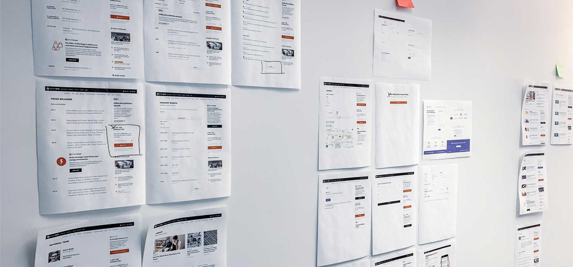
Before creating a system with our components, we needed to audit their design and functionality on our publication sites.
Our approach was comprehensive; we printed out every unique website page template that used an MVP component and taped the pages to a wall. We then sorted the pages into categories based on intended function—e.g. soft, medium, and loud calls-to-action. We saw design discrepancies across our categories. Using these buckets, we defined design guidelines and rules for component variations.
Implementing the system
After the component audit, it was time to design and code the actual system. The design system is only helpful if it is accessible to all team members working on the product. We needed to ensure that the design tools and engineering resources all aligned with the new specifications.
There were three phases to standardizing our system:
- Technical implementation: Refactor the relevant code on our live publication sites
- Sketch library: Create a Sketch UI component library for designers
- Design system site: Implement an internal design system site for Engineering to reference
1. Technical implementation
Following our live site audit, we began to refactor the relevant production code. This involved updating SCSS class names and removing page-specific styling. As part of the refactoring, we modified our SASS partials to be consistent with our new components. After lots of debate, we decided on a BEM approach. This entailed naming classes based on the component (block) and appending “–” for modifiers and “__” for elements.
After defining the style naming conventions, we applied the rules to the relevant components. We also removed any page-specific styling being applied to the components. In the end, we reduced the size of the code base, created global styes, and defined a cohesive set of design patterns.
2. Sketch library
After implementing the design system in the production codebase, we created resources for our product designers. I created a Sketch library to use as a single source of truth for design assets across the design team. The library allows designers to grab a component—e.g. button—with a predefined style and use it across files. This ensures consistent UI and negates the need to recreate the same components with each mockup.
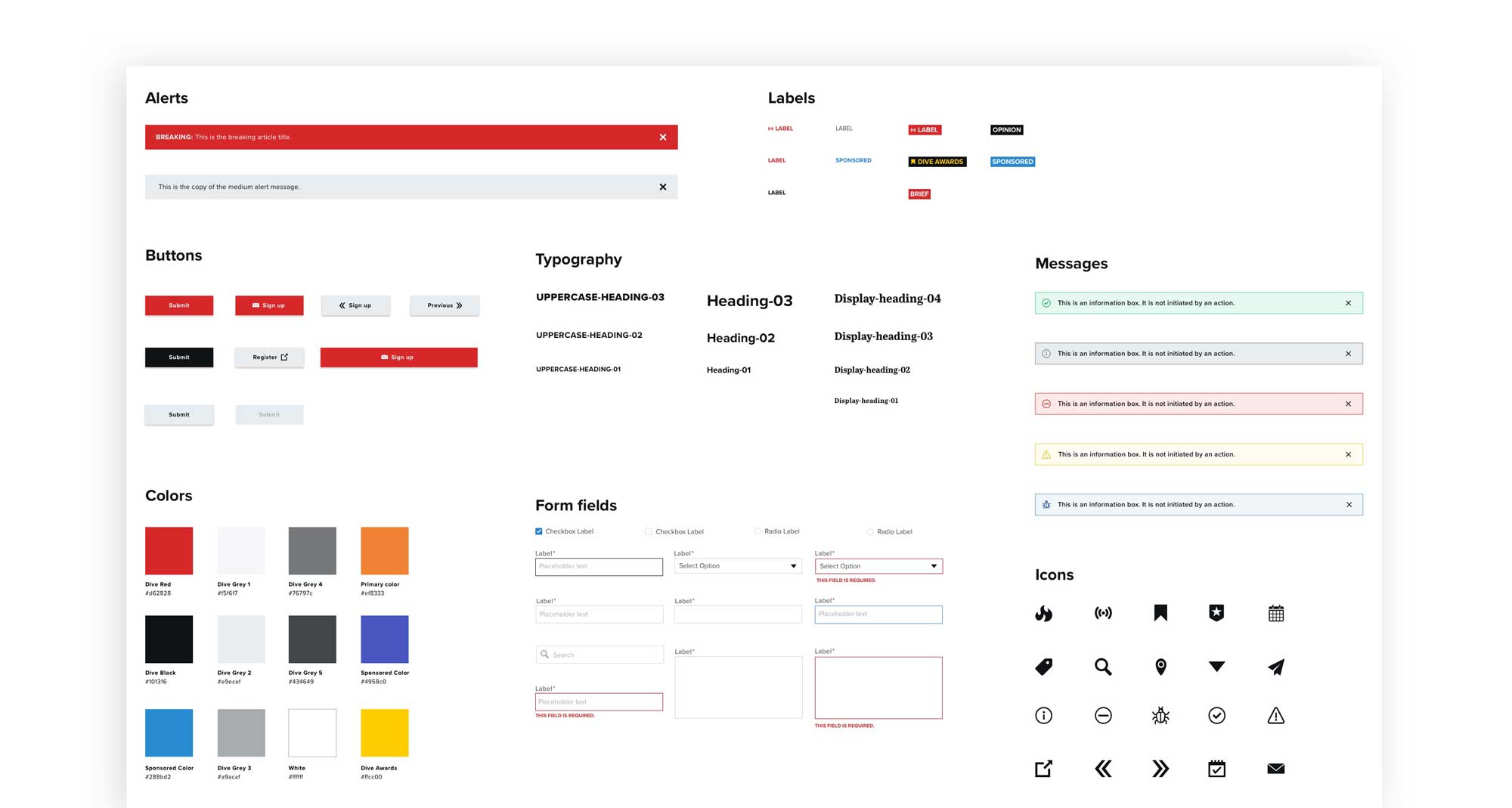
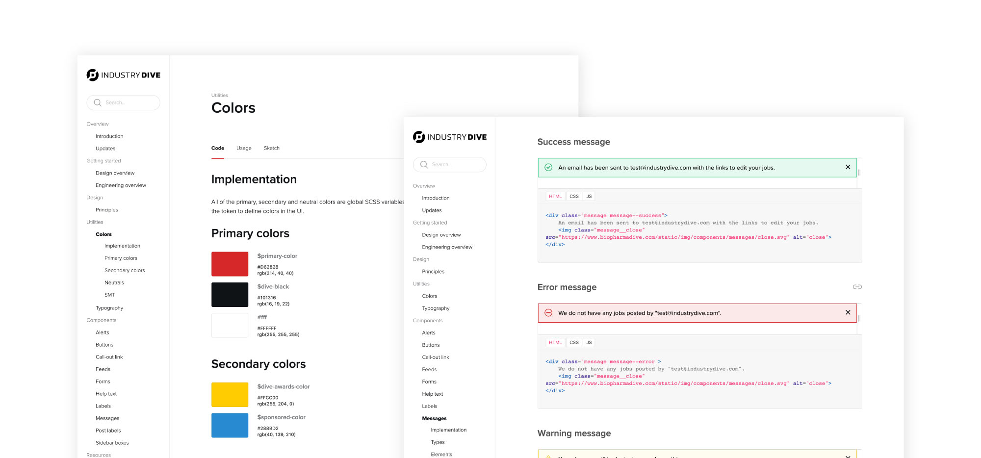
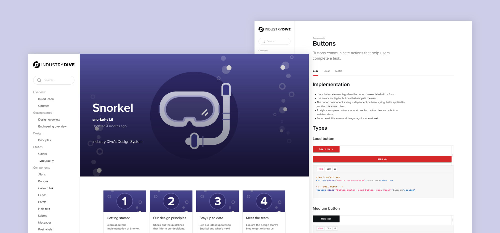
3. Design system site
After the completion of the design audit and Sketch library, we created a website with the code of our UI components and corresponding usage guidelines. The site serves as a single source of truth for engineers, designers and all other internal employees.
The creation of the design system has empowered product designers to rapidly design product interfaces and enabled engineers to implement efficiently.